
티스토리 뷰
다음과 같이 버튼에 아이콘과 레이블을 넣고 Border에 그라데이션을 준 버튼을 만들어보겠습니다.

버튼과 스타일
- 버튼을 만들고
- 스타일을 만듭니다.
- 템플릿을 Border로 바꿔줍니다.
<Window.Resources>
    <Style x:Key="Button1" TargetType="Button">
        <Setter Property="Width" Value="120" />
        <Setter Property="Height" Value="120" />
        <Setter Property="Template">
            <Setter.Value>
                <ControlTemplate TargetType="Button">
                    <Border Background="{TemplateBinding Background}" CornerRadius="8">
                        <TextBlock Text="ClickMe"></TextBlock>
                    </Border>
                </ControlTemplate>
            </Setter.Value>
        </Setter>
    </Style>
</Window.Resources>
<StackPanel Orientation="Horizontal" HorizontalAlignment="Center" VerticalAlignment="Center">
    <Button Content="홈" Style="{StaticResource Button1}" />
</StackPanel>
Grid추가
영역을 나누기 위해 Grid를 추가 해줍니다.
<Border Background="{TemplateBinding Background}" CornerRadius="8">
    <Grid>
        <TextBlock Text="ClickMe"></TextBlock>
    </Grid>
</Border>
Grid에 Row선언 하기
Grid.RowDefinitions로 Row를 선언 할 수 있습니다.
<Grid.RowDefinitions>
	<RowDefinition Height="*" />
	<RowDefinition Height="*" />
</Grid.RowDefinitions>
다음과 같이 위아래로 두개를 나누기 위해 RowDefinition을 두개 만들어 주고 반반 높이를 주기 위해 *, *로 줍니다.
<Border Background="{TemplateBinding Background}" CornerRadius="8">
    <Grid>
        <Grid.RowDefinitions>
            <RowDefinition Height="*" />
            <RowDefinition Height="*" />
        </Grid.RowDefinitions>
        <TextBlock Text="ClickMe"></TextBlock>
        <TextBlock Text="PushMe"></TextBlock>
    </Grid>
</Border>
그냥 TextBlock만 추가 하면 위와 같이 겹치기 때문에 Row를 지정 해줍니다. 0부터 지정 할 수 있습니다.
<Grid.RowDefinitions>
    <RowDefinition Height="*" />
    <RowDefinition Height="*" />
</Grid.RowDefinitions>
<TextBlock Grid.Row="0" Text="ClickMe"></TextBlock>
<TextBlock Grid.Row="1" Text="PushMe"></TextBlock>
나누는 비율 변경
Height를 7*, 3* 같이 주면 7:3이 됩니다. 8:2로 하고 싶다면 8*, 2*로 줄 수 있겠습니다.
<Grid.RowDefinitions>
    <RowDefinition Height="7*" />
    <RowDefinition Height="3*" />
</Grid.RowDefinitions>
<TextBlock Grid.Row="0" Text="ClickMe" Background="Brown"></TextBlock>
<TextBlock Grid.Row="1" Text="PushMe"></TextBlock>
그런데 조금 이상하죠? 7:3으로 잘 나누어지는지 구분하기 위해 Background를 줬는데 모서리가 둥글지 않습니다.
Border의 CornerRadius는 그 Border 자신의 Background만 둥글게 깎습니다. 자식인 TextBlock의 Background="Brown"은 별개의 사각형으로 그려지므로 둥근 모서리를 덮어버려 각지게 보입니다.
그래서 Border로 감싸주어야 합니다.
<Grid>
    <Grid.RowDefinitions>
        <RowDefinition Height="7*" />
        <RowDefinition Height="3*" />
    </Grid.RowDefinitions>
    <Border Grid.Row="0" Background="Brown" CornerRadius="8,8,0,0">
        <TextBlock Text="ClickMe"></TextBlock>
    </Border>
    <TextBlock Grid.Row="1" Text="PushMe"></TextBlock>
</Grid>

레이블 가운데 정렬
TextBlock에 아래쪽 가운데 정렬을 해줍니다.
<TextBlock Grid.Row="1" Text="PushMe"
           HorizontalAlignment="Center"
           VerticalAlignment="Center"
           ></TextBlock>
벡터(Vector) 아이콘 넣기
이미지를 넣으면 확대하거나 축소하면 이미지가 어색해지기 때문에 Vector로 삽입 하는게 좋습니다. ViewBox안쪽에 Path로 넣어줍니다.
<Border Grid.Row="0" Background="Brown" CornerRadius="8,8,0,0">
    <Viewbox Margin="16" Stretch="Uniform">
        <Path Fill="White"
              Data="M12 3 L2 12 H5 V21 H10 V14 H14 V21 H19 V12 H22 Z" />
    </Viewbox>
</Border>
<TextBlock Grid.Row="1" Text="PushMe"
           HorizontalAlignment="Center"
           VerticalAlignment="Center"
           ></TextBlock>

Border넣기
다음 버튼은 Border가 들어가 있습니다. 바로 위의 이미지와 차이 보이시나요? 왼쪽, 위쪽은 흰색 오른쪽, 아래는 회색으로 Border가 들어있습니다. 일단 오른쪽과 같이 Border를 넣어 볼 것입니다.
 |
 |
CornerRadius가 없는 Button
Button은 태생이 모서리가 둥글지 않아서 ControlTemplate을 써서 Border의 '모양'을 가지고 왔습니다. 그래서 Template쪽에 모양을 바꿔줘야 합니다. Border가 나타나게 하려면 두가지 속성을 넣어 주어야 하는데요 BorderBrush와 BorderThickness가 동시에 들어가줘야 합니다. 다음과 같이 ControlTemplate 안쪽의 Border입니다.
<ControlTemplate TargetType="Button">
    <Border Background="{TemplateBinding Background}" CornerRadius="8"
            BorderBrush="DodgerBlue"
            BorderThickness="2">
            <!--중략-->
Border 그라데이션 넣기
Border를 넣었으니 그라데이션을 넣어주도록 하겠습니다.
<ControlTemplate TargetType="Button">
    <Border Background="{TemplateBinding Background}" CornerRadius="8"
            BorderThickness="2">
        <Border.BorderBrush>
            <LinearGradientBrush StartPoint="0,0" EndPoint="1,1">
                <GradientStop Color="White" Offset="0.0" />
                <GradientStop Color="Gray" Offset="1.0" />
            </LinearGradientBrush>
        </Border.BorderBrush>

레이블에 그라데이션 넣기
레이블 영역에도 그라데이션이 들어가 있습니다. 넣어보겠습니다.

TextBlock을 Border로 감싸줍니다. 그리고 Background를 단색으로 일단 칠해 줍니다.
<Border Grid.Row="1">
    <Border.Background>
        <SolidColorBrush Color="DarkSlateBlue"></SolidColorBrush>
    </Border.Background>
    <TextBlock Text="PushMe"
               HorizontalAlignment="Center"
               VerticalAlignment="Center"
    ></TextBlock>
</Border>
여기에서 조금 당황스러운 부분이 오른쪽아래, 왼쪽 아래가 각이 져있습니다. 앞에서도 Row=0의 TextBlock의 상단이 각져있었죠? 같은 문제입니다. 그래서 CornerRadius="0, 0, 8, 8"을 줍니다. 8, 8 이 부분이 왼쪽 아래, 오른쪽 아래 입니다. 8, 8, 8, 8로 주면 둥근 모양이 되겠습니다.
<Border Grid.Row="1" CornerRadius="0, 0, 8, 8">
    <Border.Background>
        <SolidColorBrush Color="DarkSlateBlue"></SolidColorBrush>
    </Border.Background>
    <TextBlock Text="PushMe"
               HorizontalAlignment="Center"
               VerticalAlignment="Center"
    ></TextBlock>
</Border>
| 8, 8, 8, 8 |  |
| 0, 0, 0, 0 |  |
| 0, 0, 8, 8 |  |
SolidColorBrush를 LinearGradientBrush로
앞에 버튼 외곽 Border에 썼던 것을 그대로 넣어주겠습니다.
<Border Grid.Row="1" CornerRadius="0, 0, 8, 8">
    <Border.Background>
        <LinearGradientBrush StartPoint="0,0" EndPoint="1,1">
            <GradientStop Color="White" Offset="0.0" />
            <GradientStop Color="Gray" Offset="1.0" />
        </LinearGradientBrush>
    </Border.Background>
    <TextBlock Text="PushMe"
               HorizontalAlignment="Center"
               VerticalAlignment="Center"
    ></TextBlock>
</Border>
그라데이션이 들어갔는데 모양이 조금 다릅니다. 왼쪽위에서 오른쪽 아래로 흰색--> 회색으로 가능 그라데이션인데 우리가 만들고 싶은 것은 위에서 아래로 가는 그라데이션입니다.
 |
 |
| 오른쪽위 --> 왼쪽 아래 | 위 --> 아래 |
EndPoint를 를 1,1에서 0,1로 바꿔줍니다. 0,0에서 시작해서 0,1로 가니까 수직 방향으로 가게 됩니다.
<LinearGradientBrush StartPoint="0,0" EndPoint="0,1">
    <GradientStop Color="White" Offset="0.0" />
    <GradientStop Color="Gray" Offset="1.0" />
</LinearGradientBrush>
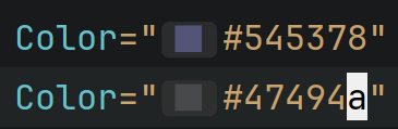
이제 색상을 바꿔보겠습니다. 파스텔톤 파란색에서 흙빛 파란색으로 가는 색인데 지금은 White, Gray로 되어 있네요.
구글 color picker로 비슷한 색의 16진수 값을 찾아줍니다.

저는 이 두가지 색을 넣었습니다. 더 정확하게 맞추려면 시스템의 Color Picker를 써서 직접 대보면 되는데 일단은 이렇게만 갑니다. 그리고 Foreground색상을 바꿔주면 되겠네요.
 |
 |

<Border Grid.Row="1" CornerRadius="0, 0, 8, 8">
    <Border.Background>
        <LinearGradientBrush StartPoint="0,0" EndPoint="0,1">
            <GradientStop Color="#545378" Offset="0.0" />
            <GradientStop Color="#47494a" Offset="1.0" />
        </LinearGradientBrush>
    </Border.Background>
    <TextBlock Text="PushMe"
               Foreground="White"
               HorizontalAlignment="Center"
               VerticalAlignment="Center"
    ></TextBlock>
</Border>
Row=0에 그라데이션 넣기
지금 Brown으로 해놓은 빨간색 영역에 그라데이션 넣어보겠습니다. 회색에서 시작해서 흰색으로 끝나는 그라데이션 같네요.

Row=0의 Border의 Background에 Gray, White를 위에서 아래로 내려가는 그라데이션을 넣어줍니다.
<Border Grid.Row="0" CornerRadius="8,8,0,0">
    <Border.Background>
        <LinearGradientBrush StartPoint="0,0" EndPoint="0,1">
            <GradientStop Color="Gray" Offset="0.0" />
            <GradientStop Color="White" Offset="1.0" />
        </LinearGradientBrush>
    </Border.Background>
    <Viewbox Margin="16" Stretch="Uniform">
        <Path Fill="White"
              Data="F0 M11 1 H13 L13.6 3.5 A8.5 8.5 0 0 1 16 4.5 L18.2 3.2 L19.8 4.8 L18.5 7 A8.5 8.5 0 0 1 19.5 9.4 L22 10 V12 L19.5 12.6 A8.5 8.5 0 0 1 18.5 15 L19.8 17.2 L18.2 18.8 L16 17.5 A8.5 8.5 0 0 1 13.6 18.5 L13 21 H11 L10.4 18.5 A8.5 8.5 0 0 1 8 17.5 L5.8 18.8 L4.2 17.2 L5.5 15 A8.5 8.5 0 0 1 4.5 12.6 L2 12 V10 L4.5 9.4 A8.5 8.5 0 0 1 5.5 7 L4.2 4.8 L5.8 3.2 L8 4.5 A8.5 8.5 0 0 1 10.4 3.5 Z M12 7 A4 4 0 1 0 12 15 A4 4 0 1 0 12 7 Z" />
    </Viewbox>
</Border>
조금 비슷해져 가고 있죠? Gray말고 조금 더 밝은 Gray인것 같네요.
 |
 |
LightGray가 조금 더 가까운 것 같습니다.

벡터 이미지 외곽선
그라데이션을 LightGray, White를 넣었더니 벡터이미지가 잘 안보여서 외곽선을 지정 해주겠습니다. 444444로 넣어주는게 보기가 가장 좋아서 넣었구요 Fill은 투명으로 넣었습니다.
<Viewbox Margin="16" Stretch="Uniform">
    <Path Fill="Transparent"
          Stroke="#444444"
          StrokeThickness="0.5"
          StrokeLineJoin="Round"
          Data="F0 M11 1 H13 L13.6 3.5 A8.5 8.5 0 0 1 16 4.5 L18.2 3.2 L19.8 4.8 L18.5 7 A8.5 8.5 0 0 1 19.5 9.4 L22 10 V12 L19.5 12.6 A8.5 8.5 0 0 1 18.5 15 L19.8 17.2 L18.2 18.8 L16 17.5 A8.5 8.5 0 0 1 13.6 18.5 L13 21 H11 L10.4 18.5 A8.5 8.5 0 0 1 8 17.5 L5.8 18.8 L4.2 17.2 L5.5 15 A8.5 8.5 0 0 1 4.5 12.6 L2 12 V10 L4.5 9.4 A8.5 8.5 0 0 1 5.5 7 L4.2 4.8 L5.8 3.2 L8 4.5 A8.5 8.5 0 0 1 10.4 3.5 Z M12 7 A4 4 0 1 0 12 15 A4 4 0 1 0 12 7 Z" />
</Viewbox>

벡터이미지 가운데 색상 지정
Canvas로 감싼 후 가운데 동그라미는 따로 그려줍니다.
<Viewbox Margin="16" Stretch="Uniform">
    <Canvas Width="24" Height="22">
        <Path Fill="DodgerBlue"
              Stroke="#444444"
              StrokeThickness="0.5"
              Data="M12 7 A4 4 0 1 0 12 15 A4 4 0 1 0 12 7 Z" />
        <Path Fill="Transparent"
              Stroke="#444444"
              StrokeThickness="0.5"
              StrokeLineJoin="Round"
              Data="M11 1 H13 L13.6 3.5 A8.5 8.5 0 0 1 16 4.5 L18.2 3.2 L19.8 4.8 L18.5 7 A8.5 8.5 0 0 1 19.5 9.4 L22 10 V12 L19.5 12.6 A8.5 8.5 0 0 1 18.5 15 L19.8 17.2 L18.2 18.8 L16 17.5 A8.5 8.5 0 0 1 13.6 18.5 L13 21 H11 L10.4 18.5 A8.5 8.5 0 0 1 8 17.5 L5.8 18.8 L4.2 17.2 L5.5 15 A8.5 8.5 0 0 1 4.5 12.6 L2 12 V10 L4.5 9.4 A8.5 8.5 0 0 1 5.5 7 L4.2 4.8 L5.8 3.2 L8 4.5 A8.5 8.5 0 0 1 10.4 3.5 Z" />
    </Canvas>
</Viewbox>

TextBlock을 ContentPresenter로 변경
<ContentPresenter
           HorizontalAlignment="Center"
           VerticalAlignment="Center"
></ContentPresenter>
<Button Content="시스템" FontSize="17" Foreground="White" Style="{StaticResource Button1}" />
 |
 |
네 조금 비슷해진 것 같습니다. 미세 조정은 디자이너님께 부탁 하는걸로 해야겠네요.
End.
- Total
- Today
- Yesterday
- 도커티슈박스
- vim
- 도커컨테이너
- 개발자
- 도커각티슈케이스
- Sh
- Linux
- shellscript
- 싱가폴
- docker container whale
- docker container
- 도커티슈케이스
- docker container tissue
- docker container case
- 2017 티스토리 결산
- 도커각티슈박스
- docker container tissue box
- 이직
| 일 | 월 | 화 | 수 | 목 | 금 | 토 |
|---|---|---|---|---|---|---|
| 1 | 2 | |||||
| 3 | 4 | 5 | 6 | 7 | 8 | 9 |
| 10 | 11 | 12 | 13 | 14 | 15 | 16 |
| 17 | 18 | 19 | 20 | 21 | 22 | 23 |
| 24 | 25 | 26 | 27 | 28 | 29 | 30 |
| 31 |